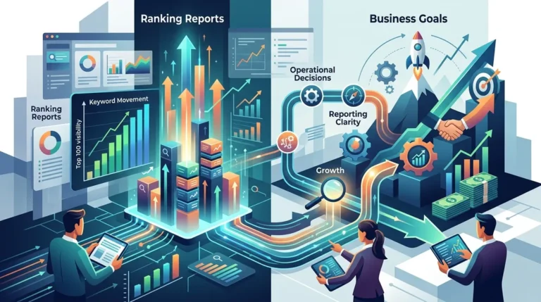
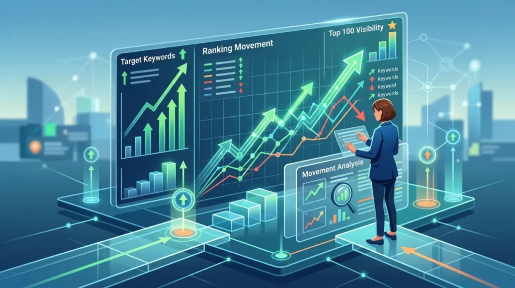
Raw ranking data is often a liability rather than an asset. When an SEO professional exports a CSV containing 5,000 keywords, the sheer volume of "up 2" or "down 5" movements creates a noise floor that obscures actual performance trends. To move from data collection to operational decision-making, you must transform static position numbers into visual narratives that highlight commercial impact, competitive shifts, and algorithmic volatility.
Effective visualization isn't about making charts look attractive; it is about reducing the time-to-insight for stakeholders who need to know if a strategy is working. This requires moving beyond the "average rank" metric and toward weighted visibility and distribution analysis.
Prioritizing Share of Voice Over Average Position
Average position is a mathematically flawed metric for high-volume accounts. A site ranking #1 for 10 low-volume long-tail terms and #50 for a high-intent "head" term will show a deceptive average rank of #5.4. This obscures the fact that the most valuable traffic source is invisible on page five.
Share of Voice (SoV) solves this by weighting rankings against search volume. When visualizing this, use an area chart to show the percentage of total available clicks your site captures within a specific keyword set. This allows you to see if a drop in ranking for a high-volume keyword is being offset by gains across several mid-volume terms, or if your overall market presence is shrinking.
Segmenting by Keyword Intent
Visualizing every keyword on a single line graph is a recipe for confusion. Instead, segment your data into clusters based on the user journey:
- Informational: Top-of-funnel "how-to" and "what is" queries.
- Commercial: Comparison and "best of" queries.
- Transactional: High-intent "buy" or "service near me" queries.
- Branded: Keywords containing your company or product name.
By plotting these as separate series, you can identify if a broad algorithm update hit your informational blog content while leaving your high-converting product pages untouched. This level of granularity prevents "panic reporting" when non-revenue-generating pages fluctuate.
The Ranking Distribution Heatmap
To understand the health of a large-scale SEO project, you need to see the "shape" of your rankings. A distribution chart—specifically a stacked bar chart showing the number of keywords in positions 1-3, 4-10, 11-20, and 21-100—provides an immediate diagnostic of site authority.
If the "1-3" bucket is shrinking while the "11-20" bucket is growing, you aren't losing relevance; you are losing the competitive edge on the first page. This visualization signals a need for content refreshes or backlink acquisition rather than a total technical overhaul. Conversely, a sudden spike in the "21-100" range often indicates that new content is being indexed but has not yet gained the trust required to break into the top results.
Pro Tip: When presenting to executives, overlay your ranking distribution with a line graph of organic sessions. If rankings are stable but traffic is dropping, it usually indicates a change in SERP features, such as a new AI Overview or an expanded PPC block, rather than an SEO failure.
Visualizing Competitor Movement and Gap Analysis
Rankings do not exist in a vacuum. Your movement is always relative to the performance of your direct competitors. A "Share of Voice" stack chart is the most effective way to visualize this. By plotting your SoV against four or five key competitors over a six-month period, you can identify who is gaining "market share" in the SERPs.
Best for: Identifying aggressive competitor content sprints or identifying when a competitor has been hit by a site-wide penalty.
Identifying Keyword Cannibalization Visually
Cannibalization is difficult to spot in a spreadsheet but obvious in a trend line visualization. When two or more URLs from your domain are competing for the same keyword, their ranking lines will often "flip-flop" or mirror each other. One URL will drop from #4 to #80 while another jumps from #90 to #5. Visualizing this "sawtooth" pattern allows you to quickly identify where 301 redirects or canonical tag adjustments are needed to consolidate authority into a single high-performing page.
Quantifying the Impact of SERP Features
Modern rank tracking must account for the reality that a #1 organic position is often pushed "below the fold" by Featured Snippets, Local Packs, and People Also Ask (PAA) boxes. A clear visualization should distinguish between "Pure Organic Rank" and "Visual Rank."
Use a dual-axis chart to plot your organic position alongside the number of SERP features present for those keywords. If you see your organic rank holding steady at #2, but your CTR is declining, your visualization should highlight the arrival of a new "Top Products" carousel or an aggressive Google Ads layout. This data justifies why "maintaining rank" may no longer be enough to maintain traffic levels.
Operationalizing Your SEO Reporting
To make your ranking visualizations actionable, move away from monthly static PDFs and toward dynamic dashboards that allow for date-range comparisons. Your goal is to identify the "Delta"—the specific change between two points in time. Focus on "Top Winners" and "Top Losers" by estimated traffic value, not just position change. A move from #2 to #1 on a 10,000-volume keyword is worth significantly more than a move from #50 to #10 on a 100-volume keyword. Your reporting should reflect this commercial reality by scaling the "bubbles" or "bars" in your charts based on search volume or potential revenue.
Frequently Asked Questions
How often should I update my ranking visualizations?
For high-volatility industries like e-commerce or news, daily tracking is necessary to catch algorithmic shifts. However, for most B2B or service-based industries, weekly updates provide enough data to identify trends without getting distracted by daily "SERP weather" fluctuations.
What is the best way to show ranking data to non-SEO stakeholders?
Avoid technical jargon like "canonicalization" or "keyword density." Use a Share of Voice chart to show how much of the "market" you own compared to competitors. Relate ranking gains to "Estimated Traffic Value" to put a dollar amount on SEO performance.
Why does my rank tracking software show a different position than my manual search?
Manual searches are influenced by your IP address, search history, and device type. Professional tracking software uses clean-room environments to provide a localized but unbiased view of the SERP. Always trust the aggregate data over a single manual search.
How do I visualize the impact of a specific site migration or update?
Use "Event Markers" on your timeline charts. Annotate the exact date of the migration or content update. This allows you to see a clear "Before vs. After" in your ranking distribution and Share of Voice, making it easy to attribute success or failure to specific actions.